Create Diagrams That Look Like Hand-drawn
Get started with Excalidraw
Janne Kemppainen |Yesterday I heard about an open source project called Excalidraw which is an app that lets you draw diagrams that look like they were done by hand. Its development started on January 1st, and now 25 days later it has already had 44 contributors and 2.5k stars on GitHub.
Even though it is still quite new and actively under development the results are already quite impressive so I felt the need to piece together a small “tutorial” to show you what it can be used for. If you want to create cool looking flow charts or other diagrams this might be all you need!
Basics
The UI is really simple. It lets you add the following elements on the canvas (shortcuts in parentheses):
- rectangle (R)
- diamond (D)
- ellipse (E)
- arrow (A)
- line (L)
- text (T)
When you insert an element on the page you can change its properties to change how it is rendered. You can change the outline and fill colors, stroke width, sloppiness and opacity. You can also reorder the elements using the layers to bring the element to the top or move it behind other elements.
Arrows and lines can be drawn by clicking and dragging to the desired end point which creates a straight line. You can create curves by selecting the line or arrow tool, clicking once, then clicking any mid-way points, and finally pressing the esc key to stop adding new points.
When an item is selected you can rotate it by dragging the small circle and resize from the rectangles just as you’d do in any other application.
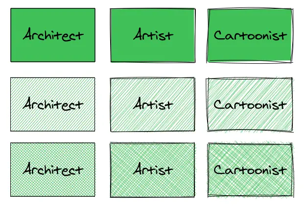
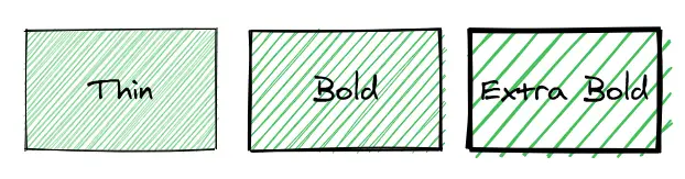
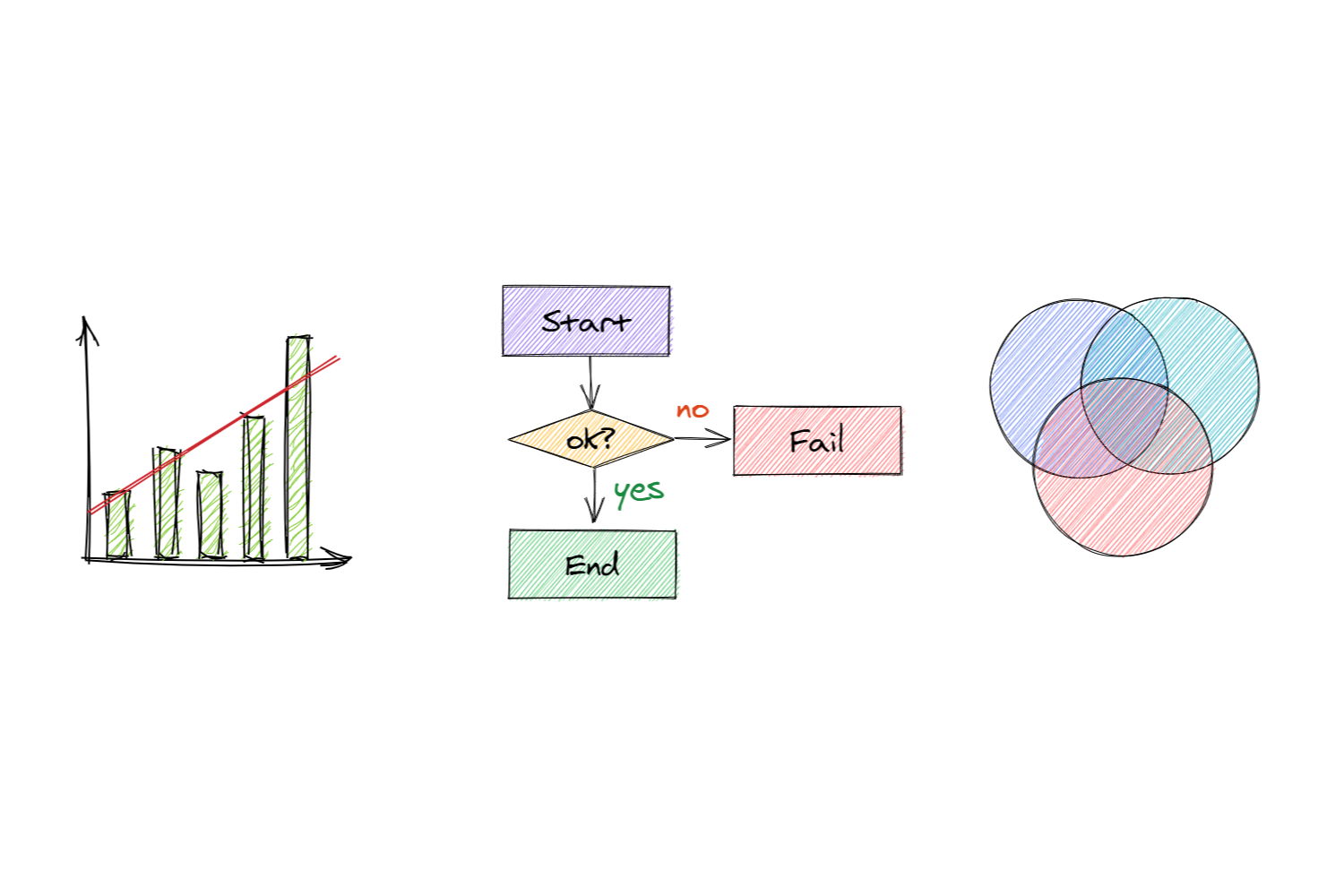
The app has three levels of “sloppiness” that change the way the lines are drawn. When you select “Architect” the lines are very straight and clean. The “Artist” selection makes the lines a bit more lively while the “Cartoonist” takes it one step further. The image below shows the differences.
The fill selection has three options: “Solid”, “Hachure” and “Cross-Hatch” that are illustrated below with different sloppiness levels.
Finally, you have a selection of three stroke widths.
Along with color and opacity selection these are all your controls in the app. What could you even draw with just these simple components? Quite a lot actually!
Live-collaboration
Lot’s of development has happened since I initially wrote this article. One major feature that has been added is the support for live-collaboration sessions. This feature alone makes the project a hugely useful addition to your toolset, especially now that so many people are working from home.
Starting a collaboration session is easy, there is an icon on the top left side with two people in it. From there you’ll get a shareable link to your session that you can share with your friends or coworkers.
The best part is that the communication is fully encrypted end-to-end so all your data will stay private. The communication happens in a peer-to-peer fashion so the data is not stored on the Excalidraw server.
Examples
Here are some examples that I quickly drew just because it was so fun to do so. I don’t consider myself artistic at all and I can’t really draw so I was quite surprised how effortless it was to piece these together.
Service architecture
In this first example I imagined a simple service where the user communicates with the application server through a load balancer, and the app instances would then talk with the database. I also added a “backend service” that would for some reason talk with the GitHub and Twitter API’s to populate the database.
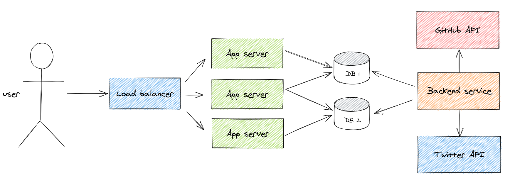
Drawing simple lines and circles is easy so the stick man was easy to do. Also all the boxes and arrows come straight out of the box.
However, the database cylinders required a bit of tweaking because at first the lower ellipse was fully visible making it look quite odd. So I added a white box (architect sloppiness) to hide the upper part of the ellipse and then simply drew the missing two edges with straight lines.
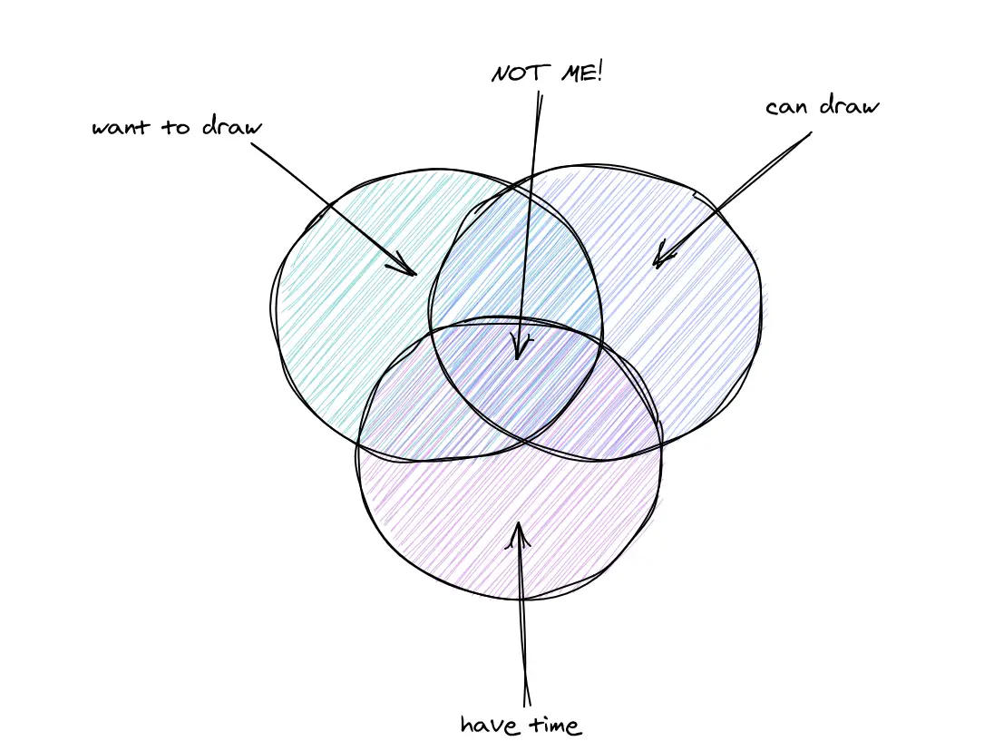
Venn diagram
Everyone loves (or hates) Venn diagrams! Copying and pasting works really well here so that you can get circles with the same radius.
When you paste an object its center will be placed at the location of your pointer. Threfore if you have selected the object that you want to copy you can use the resize handles to guide the paste placement. If you paste above the middle resize handle of one side the circles will overlap half of each other’s width.
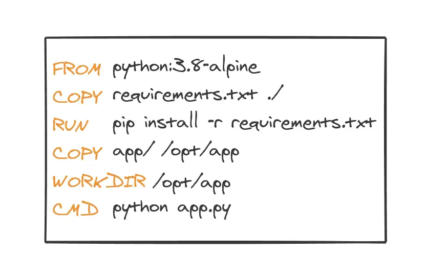
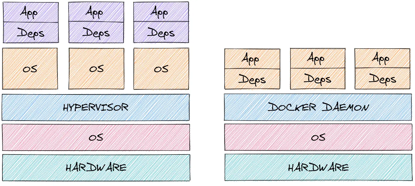
Docker vs VM
Here’s a drawing with just simple boxes. This one shows the difference between an app running on top of Docker and a virtual machine.
Website mockup
Finally, I made a mockup of the home page of my blog. For such a simple layout it worked surprisingly well. It took me maybe fifteen to twenty minutes to piece this together and I’m quite pleased with how it turned out.
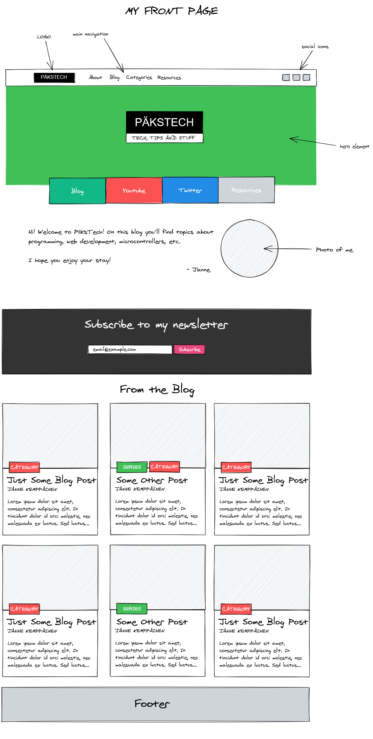
If you compare this drawing to the front page of this site you’ll notice that I didn’t add the skew that I have in the logo, categories etc. This is where the app’s simplicity shows itself.
Still, I can’t really complain for this is a wonderful tool that surely has a purpose.
Conclusion
So there you have some ideas and examples for drawing cool diagrams. I think that next time that I need to have some sort of an illustration or a graph I’ll try to implement it first with Excalidraw. It’s just so fast and easy to create quick sketches with it if your needs are not too fancy.
The feature set will surely improve over time but I hope that they will be able to maintain the simplicity. That said I sure would like to see bezier curves and other shapes added to the mix.
What would you draw with Excalidraw? Share your examples on Twitter! (Maybe these will give you some inspiration?)
Previous post
Environment Variables in Python