Create a Web App with Vue 3, Tailwind CSS and Storybook
Janne Kemppainen |I’ve been doing some small scale frontend development for a while now, and I have to say that I’ve really grown to love the Vue.js framework. Combined with Tailwind CSS and Storybook it makes for a strong starting point for your next web app!
I found that it was a bit challenging to get started with this exact combo as the needed information was scattered around the web. Therefore, I hope that this article lets you jumpstart your next project.
Intro to the used tech
Before diving in to the technical details, let’s quickly cover the basics of each component in our stack. If you’re already familiar with these technologies, feel free to skip to the next section!
Vue.js
Vue.js is a frontend framework that is easy to learn if you’re familiar with JavaScript, HTML and CSS. (Personally, I prefer it over React.js but that’s just my opinion.)
A Vue application consists of components that are written in a specific format and use the .vue file extension. Each component defines how it is rendered using the <template> block, contains application logic inside the <script> block, and includes embedded styling within a <style> block. Simple components may not even need to use the script or style blocks.
<template>
<p>HTML goes here</p>
</template>

<script>
// JS goes here
</script>

<style scoped>
/* CSS goes here */
</style>
These Vue files are also called Single-File Components; the whole component logic, HTML structure and styling is contained in a single file. This is a promising starting point when we want to create an application of atomic components.
Components can accept data via props, and emit events to pass information back to the parent component, enabling interactivity and showing custom data. For complex state management you should use the Pinia store library instead.
The Vue documentation is quite good, and you should give it a read if you’re serious about working with Vue. Start from the introduction and go on from there.
Tailwind CSS
Tailwind CSS is a utility-first CSS framework. Unlike more traditional CSS frameworks, such as Bootstrap or Bulma, Tailwind doesn’t include ready made components. Instead, it contains lots of small classes that can be combined to build custom components directly inside the markup.
The “normal” way to build Vue components would include scoped styling with CSS that applies only to the component in question. With Tailwind CSS we can skip the whole style block as the component can be styled by using Tailwind’s utility classes inside the HTML template. These classes can be applied conditionally based on the component state or props, so we can build reactive components quite easily.
What I find great about Tailwind is that you can get going even if you don’t know CSS thoroughly. Of course, understanding CSS concepts such as flexbox is essential for being able to work efficiently with Tailwind but there are so many examples around that you can learn the commonly used things by imitating others and toggling Tailwind’s classes on and off to see what they do.
Maybe the best thing about Tailwind are the resources that are available for you:
Everything that you can do with Tailwind, you can find from the documentation. At first, you’ll spend a lot of time here but after a while you’ll start to remember many of the classes without looking them up.
I said that Tailwind didn’t come with components, but you could argue that it actually kind of does. Tailwind UI is a library of UI components from the creators of Tailwind CSS. It contains some free ones but most of the components are behind a paywall. With the paid version you also get some full website templates.
I’ve personally bought their one-time purchase lifetime access and find it really invaluable. The components are really well thought out with accessibility in mind, and they use Headless UI to handle user interactions.
Flowbite is an open-source component library for Tailwind. All the basic components are free, and there are quite a lot of them. Flowbite Blocks is a set of Tailwind components that cover things such as headers, hero sections or pricing tables. Each set of components contains one or two free versions and a few advanced versions that are available if you buy the Pro plan (I haven’t bought it myself).
Storybook
Storybook is a tool for building UI components and pages in isolation. You write files called stories that define the different states that your components can be in, and then you can see them individually rendered on a browser. The combination of Vue SFCs and Tailwind CSS is perfect for the idea of rendering components independently of each other.
For each Vue component you can create a corresponding .stories.js file. When you run Storybook locally on your own computer you can browse all pages and components that have their own stories.
The local Storybook development server live reloads when you make changes to the component source code. This way you can verify how a component renders in different states without manually interacting with the whole application.
Storybook has built-in support for Vue. So again, after reading this article, start from the documentation introduction to get a deeper understanding of how Storybook works.
Project setup
Now let’s go through setting up each component of our stack. I’m assuming that you already have your development machine set up with a Node.js installation.
Initialize a Vue project
Open a new terminal window in the directory where you want to store your new project and initialize a Vue project:
$ npm init vue@latest
npx: installed 1 in 1.388s

Vue.js - The Progressive JavaScript Framework

✔ Project name: … tailwind-storybook
✔ Add TypeScript? … No / Yes
✔ Add JSX Support? … No / Yes
✔ Add Vue Router for Single Page Application development? … No / Yes
✔ Add Pinia for state management? … No / Yes
✔ Add Vitest for Unit Testing? … No / Yes
✔ Add Cypress for both Unit and End-to-End testing? … No / Yes
✔ Add ESLint for code quality? … No / Yes

Scaffolding project in /home/janne/tailwind-storybook...

Done. Now run:

  cd tailwind-storybook
  npm install
  npm run dev
The initialization script asks you questions such as the project name and which libraries to include in your setup. For simplicity, I named my project tailwind-storybook and answered “No” to all questions. This leaves us with a Vue project without TypeScript, a router, state management, or a testing setup.
Install the dependencies as instructed by the installation script and start the Vue development server to verify that everything is working correctly. The Vite server gives you a localhost URL that you can open in your browser. Quit the development server process with Ctrl-C .
If you need help you can check the official Vue installation instructions.
Install Storybook
Now it’s time to install Storybook. Just run this one command and wait for it to finish.
$ npx storybook init
You can check that the installation was successful by running
$ npm run storybook
Now if you navigate to http://localhost:6000 you should see the Storybook UI with some example stories. Stop the Storybook server with Ctrl-C.
The example stories can be found from the ./src/stories directory inside your project. You can go and inspect them but we won’t be using them in our project so go on and delete that directory.
$ rm -r ./src/stories
Remember that you can check the Storybook documentation for more details whenever there is something you don’t understand.
Configure Tailwind
Finally, we need to install and configure Tailwind CSS. These are the dependencies that need to be installed.
$ npm install --save-dev tailwindcss postcss autoprefixer @storybook/addon-postcss
Generate a Tailwind config file:
$ npx tailwindcss init -p
The -p flag also generates a PostCSS config.
Now if you haven’t done that yet, open the project directory in VS Code or your favourite IDE. Add the Vue template paths in the Tailwind configuration file:
module.exports = {
  content: [
    "./index.html",
    "./src/**/*.{vue,js,ts,jsx,tsx}",
  ],
  theme: {
    extend: {},
  },
  plugins: [],
}
Next, create the CSS index file inside the src directory:
@tailwind base;
@tailwind components;
@tailwind utilities;
Change the CSS import in main.js to point to the new CSS file:
import { createApp } from 'vue'
import App from './App.vue'

import './index.css'

createApp(App).mount('#app')
Import the same file also in the Storybook preview file so that Storybook can use it.
import '../src/index.css';

export const parameters = {
  actions: { argTypesRegex: "^on[A-Z].*" },
  controls: {
    matchers: {
      color: /(background|color)$/i,
      date: /Date$/,
    },
  },
}
Configure the Storybook PostCSS addon.
module.exports = {
  "stories": [
    "../src/**/*.stories.mdx",
    "../src/**/*.stories.@(js|jsx|ts|tsx)"
  ],
  "addons": [
    {
      name: '@storybook/addon-postcss',
      options: {
        cssLoaderOptions: {
          importLoaders: 1,
        },
        postcssLoaderOptions: {
          implementation: require('postcss'),
        },
      },
    },
    "@storybook/addon-links",
    "@storybook/addon-essentials",
    "@storybook/addon-interactions"
  ],
  "framework": "@storybook/vue3",
  "core": {
    "builder": "@storybook/builder-vite"
  },
  "features": {
    "storyStoreV7": true
  }
}
Now both Vue and Storybook should be able to utilize the Tailwind classes.
Clean up
Before continuing with the component development let’s get rid of the default components that were generated by Vue.
rm -r src/assets
rm -r src/components/*
This removes all of the autogenerated “hello world” assets and leaves us with an empty components directory. The App.vue file still refers to the removed components, so let’s simplify it for now.
<script setup>
</script>

<template>
  <main>
    My App
  </main>
</template>
Now if you run npm run dev you should see a simple page that says “My App”.
Developing components
The idea of working with Storybook is to create components from the bottom up. Atomic components, such as buttons, are combined to create more complex combinations, such as input forms.
To avoid collisions with HTML tags or Vue’s built-in components, all of our custom components should have multi-word names. The root App component is an exception to the rule.
If you need a reminder of Vue components the Components Basics page on Vue docs goes through the essentials in more detail.
Creating the AppButton story
Every web application needs to have a button somewhere, so let’s create a custom button component! As I already mentioned, Vue component names should consist of at least two words, so we’ll give it a name AppButton.
We want to be able to set the button text using a slot, and we’ll also want an outlined version. With this starting info we can write a skeleton for the button.
<template>
  <button type="button">
    <slot></slot>
  </button>
</template>

<script setup>
defineProps({
    outlined: Boolean
})
</script>
Since we want to be able to see what we’re developing, let’s also create an accompanying story for the button. Our requirements can be translated to the following story:
import AppButton from "./AppButton.vue";

export default {
  title: "Components/AppButton",
  component: AppButton,
  argTypes: {
    outlined: { control: "boolean" },
  },
};

const Template = (args) => ({
  components: { AppButton },
  setup: () => ({ args }),
  template: '<AppButton v-bind="args">{{ args.default }}</AppButton>',
});

export const Primary = Template.bind({});
Primary.args = {
  default: "Button text",
};

export const Outlined = Template.bind({});
Outlined.args = {
  ...Primary.args,
  outlined: true,
};
The default export defines metadata that is applied to all stories. The title property controls what is shown on the Storybook sidebar where all the components are listed. You can organize components and pages to different groups by creating a hierarchy with the / character as a separator.
The component property selects the Vue component that we have imported and argTypes defines the input controls that are shown for all stories. Some input types are automatically inferred, and in this case it’s actually not needed. Manual argument configurations can be helpful when you have a limited number of allowed values and want to list them as a dropdown menu, for example. You can read more from the Controls addon documentation.
The Template function is a way to reuse the same logic for multiple stories. Basically, it defines how the component should be rendered and how the arguments are to be applied. In the template we bind args.default as the inner value of the AppButton. This is the argument name that Storybook infers for the default slot.
The two named exports Primary and Outlined are what are then shown on the Storybook sidebar. Each story defines its own arguments but we can destructure the existing arguments from the primary story to avoid duplication.
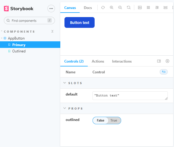
Run the Storybook server with npm run storybook. Now you should see the AppButton listed under the Components section with two stories. The button is still unstyled but we’ll fix that next.
Styling the AppButton
Now we’re ready to actually implement our button. Keep the Storybook development server running so that you can live preview the changes that you make.
As I already mentioned, you can find lots of resources on the internet for styling things with Tailwind CSS. I’m going to use the Flowbite Buttons as inspiration. To keep things simple I’m going to ignore the dark theme support altogether.
<template>
  <button
    type="button"
    class="font-medium rounded-lg text-sm px-5 py-2.5 mr-2 mb-2"
    :class="{
      'text-white bg-blue-700 hover:bg-blue-800': !outlined,
      'border border-gray-200 hover:bg-gray-100': outlined
    }"
  >
    <slot></slot>
  </button>
</template>

<script setup>
defineProps({
  outlined: Boolean
})
</script>
There are two types of class definitions here. The class attribute adds those Tailwind classes that can be applied to all button variants. In this case they all have the same font size, rounded corners, and some margin and padding.
The :class directive is used to set dynamic classes, in this case depending on the value of the prop outlined. The classes can be defined as an object or an array. An equal implementation using the array syntax would be the following:
:class="[
    outlined
      ? 'border border-gray-200 hover:bg-gray-100'
      : 'text-white bg-blue-700 hover:bg-blue-800'
]"
If you toggle the outlined prop between true and false on Storybook you should see the button switch colors.
Buttons are only useful when you can use them to make stuff happen. Luckily for us, our button already works correctly because of Vue’s fallthrough attributes. Since the button component contains a single root element, attributes are automatically passed to the underlying button element even if they are not declared as props. Therefore we can just use the @click event handler to set a callback function.
<AppButton @click="onClick">Button text</AppButton>
The same rule applies to the class definitions. We can set new classes to the AppButton component, and those will be automatically merged with the underlying <button>’s classes.
ImageCard
Now that we have a button, let’s create a component that makes use of it. We’ll create a card component for selling images. The image is shown at the top, then there should be a title with some text and two buttons. There should also be a price displayed on the right side of the title with an option to show an old price.
Lets start by defining a story for a component called BuyImageCard.
import BuyImageCard from "./BuyImageCard.vue";

export default {
  title: "Components/BuyImageCard",
  component: BuyImageCard,
};

const Template = (args) => ({
  components: { BuyImageCard },
  setup: () => ({ args }),
  template: '<BuyImageCard v-bind="args" />',
});

export const Default = Template.bind({});
Default.args = {
  title: "Look at this image!",
  text: "This image is very nice. Would you like to buy it?",
  imageUrl: "https://picsum.photos/400/300",
  price: "$199",
};

export const WithOldPrice = Template.bind({});
WithOldPrice.args = {
  ...Default.args,
  oldPrice: "$299",
};
The story is mostly the same as we had with the button component. The component name has been changed and the parameters are different. The template part doesn’t have inner content since we’re not going to use a slot for any of the card data.
Now let’s implement the BuyImageCard component:
<template>
  <div class="max-w-sm bg-white rounded-lg border border-gray-200 shadow-md">
    <img class="rounded-t-lg h-56 w-full object-cover" :src="imageUrl" />
    <div class="p-5">
      <div class="flex justify-between">
        <h5 class="mb-2 text-2xl font-bold tracking-tight text-gray-900">
          {{ title }}
        </h5>
        <p class="self-center text-green-700">
          <span class="text-gray-400 line-through" v-if="oldPrice">
            {{ oldPrice }}
          </span>
          {{ price }}
        </p>
      </div>
      <p class="mb-6 font-normal text-gray-700">{{ text }}</p>
      <AppButton class="w-full" @click="buyClick">Buy it</AppButton>
      <AppButton class="w-full" @click="cancelClick" outlined>Cancel</AppButton>
    </div>
  </div>
</template>

<script setup>
import AppButton from "./AppButton.vue";

defineProps({
  title: String,
  text: String,
  imageUrl: String,
  price: String,
  oldPrice: String,
  buyClick: Function,
  cancelClick: Function,
});
</script>
The whole component is wrapped in a div that sets a maximum width, white background, rounded borders and a drop shadow. The card image has a rounded top, fixed height, full width of the card, and it is set to cover the full space. The image source attribute is set from the imageUrl prop.
The title and price displays are placed in a flex container where the justify-between class aligns them to the opposite sides. The price display contains a span element for the old price. Its visibility is controlled using a v-if statement so that it’s only added to the page when the oldPrice prop has been defined.
The card text is added with just some little styling.
At the bottom we have two instances of the AppButton. Here I’m also demonstrating the use of fallthrough attributes. We add the w-full class to make the buttons consume the full width of their container. It would be really easy to make this a customizable prop of the button component itself, but I’m going to leave that for you to implement.
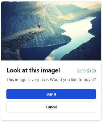
This is how the card renders:
Notice how the props also contain two function inputs: buyClick and cancelClick. These can be used to bind callback functions to the corresponding button elements. This way the card component itself doesn’t implement the buying functionality but it can be wired to handle the user interactions.
Conclusion
After you have built the basic building blocks for your application you can continue with building complete pages. When you add features such as Vue Router, Pinia state management or user authentication, things tend to get a bit more complex. If you try to decouple your application UI from the business logic you can keep using your existing stories. Though, ditching Storybook when your components are designed is also one option..
Remember to browse the Storybook addons page for addons that might aid your development. Here are some examples you could take a look at:
I hope you enjoyed this tutorial. Let me know if you’d like to see more Vue 3 content!
Previous post
Optional Arguments in Azure DevOps