Implemement Hugo List and Taxonomy Pages
Janne Kemppainen |Until now we have concentrated on single pages such as blog posts or special pages. While we do already have a basic and functional list page for our blog it isn’t particularly pretty.
So in this post you will learn how to create a decent looking layout to display multiple blog posts on a single page.
The very first thing that we need to do is to add some more content so that we’ll have something to be shown on the list page. I just downloaded some more images from <unsplash.com> and copied and pasted the existing blog posts which contained dummy content.
I changed the images parameter from the front matter of each page so that they’ll have different title images and also adjusted the publish dates and titles to get some variation. You should use the hugo new command that we learned earlier to get some more practice.
Create a new list template
Our current implementation for the list template is really general as you can see:
{{ define "main" }}
<div class="container">
    <div class="section">
        <div class="content">
            <h1>{{ .Title }}</h1>
            {{ .Content }}
            <ul>
            {{ range .Pages }}
                <li><a href="{{ .Permalink }}">{{ .Title }}</a></li>
            {{ end }}
            </ul>
        </div>
    </div>
</div>
{{ end }}
Because this file is located under the layouts/_default directory inside our theme it is currently the last resort that Hugo uses for creating the /blog/ page. Let’s start by creating a new template file just for the blog section.
The layouts/blog/ directory already contains single.html which is used for single blog posts. Add a new file list.html next to it with the following contents:
{{ define "main" }}
<div class="container">
    <div class="section">
        <div class="content">
            <h1>{{ .Title }}</h1>
            {{ .Content }}
        </div>
    </div>
</div>
{{ end }}
If you have your development server running and the browser pointing to http://localhost:1313/blog/ you should see the list of links disappear. This means that you have added the file in the right location.
Page layout
Before trying to create the elements for each of the blog posts lets start defining the overall page layout. I have added a total of eight dummy posts to the site so let’s start by listing their titles on two columns.
We are still using Bulma as our CSS framework so we can get help from the columns documentation. Let’s go for a two column layout.
This is really easy to achieve. All we need is to set a multiline columns container and loop the pages to create column items with half-lengths.
Add the following snippet after the content div that contains the page title.
 <div class="columns is-multiline">
    {{ range .Pages }}
    <div class="column is-half">
        <a href="{{ .Permalink }}">{{ .Title }}</a>
        <div class="content">
            {{ .Summary }}
        </div>
    </div>
    {{ end }}
</div>
The page should now look something like this. Note that the amount of text shown on this page depends on the length of your summary. By default Hugo takes the first 70 words as the summary. Add a manual summary split with the magic comment:
<!--more-->I recommend using the manual split because it causes the HTML structure to be passed properly to the .Summary element. When resorting to the default split all text (including titles) will be added without any markup.
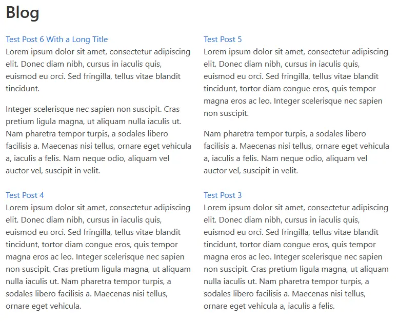
A simple grid of blog posts
This doesn’t look too bad! If you try resizing the browser window you’ll notice that on smaller screens the layout switches to a single column automatically.
For now this is all we need for the layout of the page.
Post cards
Next we need to implement card elements that will show the post title, an image and the text summary. This is a great opportunity to use partials!
So instead of adding lots of code on the list.html file we can create reusable modules that are easier to manage.
Basic post widget
Create a new directory to /layouts/partials/widgets. This is where we will be storing our custom components. I’m going to call these partials “widgets”.
Create a new file called post-card.html inside the new widgets directory and copy the existing post definitions there:
<a href="{{ .Permalink }}">{{ .Title }}</a>
<div class="content">
    {{ .Summary }}
</div>
Now start using the partial in the list.html file:
<div class="columns is-multiline">
    {{ range .Pages }}
    <div class="column is-half">
        {{ partial "widgets/post-card.html" . }}
    </div>
    {{ end }}
</div>
The only difference to the previous version is that now the column div contains only a single partial definition. The page should still look the same as before but now we have nice separation of responsibilities where the list.html takes care of the overall layout and post-card.html only handles the single post items.
Let’s start defining the card layout. Here is a basic card with an image, a title and the summary text:
{{ $permalink := .Permalink }}
<div class="card">
    <div class="card-image">
        <figure class="image is-3by2">
            {{ with .Params.images }}
            <a href="{{ $permalink }}"><img src="{{ index . 0 }}" alt=""></a>
            {{ end }}
        </figure>
    </div>
    <div class="card-content">
        <a class="title is-4" href="{{ .Permalink }}">{{ .Title }}</a>
        <div class="content">
            {{ .Summary }}
        </div>
    </div>
</div>
Let’s go through this piece by piece.
First of all, the current context inside the partial template is a single page as we call the partial inside a range of pages on the list template file. This means that we can use page variables as if we were on a standard page.
The very first line stores the permalink of the page to a variable so that it can be used later on. Then there are the elements with the Bulma classes which define cards. The whole component is wrapped inside a card element which is divided into two parts: card-image and card-content.
The card-image element contains a figure which has an aspect ratio of 3 by 2. For optimal results make sure that the images in your post headings always have this aspect ratio.
Inside the figure there is a with clause which applies only if the images parameter has been set in the page front matter. If a blog post doesn’t have an image you can still build the site without errors which is nice if you like to add lots of drafts like I do.
The with clause changes the current context to the content of the images list. This is why we had to store the permalink to a separate variable. An anchor element with the permalink wraps the img element. The image source can be selected with the index function by choosing the first element in the list.
Just to remind you, the image definition in the front matter of a blog post should look something like this:
images:
  - /images/blog/2019/water.jpg
Next we have the card content which is really simple. The page permalink and title form the post title element which is a clickable link. The summary is inserted inside a content div which allows it to be properly formatted.
A single card should now look like this:
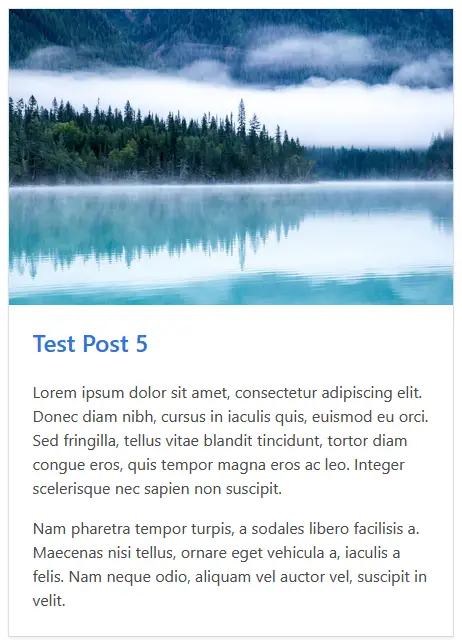
A simple card element
Add author and date information
If you’ve followed this tutorial series then your config.toml probably contains the author parameter. If not, make sure that the configuration file contains the following section:
[params]
    author = "Janne Kemppainen"
I’m not going to add support for multiple authors just now. I might consider it in a future blog post.
If you add the following piece of code right after the title definition you should see your name and the publish date of the blog post right below the title with the heading style.
<span class="heading">{{ .Site.Params.Author }} | <time>{{ .PublishDate.Format "January 2, 2006"}}</time></span>List categories
I also wanted to display the categories for each blog post at the bottom of the card and I actually found a pretty neat way of doing it with pure Bulma without using any custom CSS.
Add the following piece of code at the end of the card-content div.
<div class="tags is-pulled-right">
    {{ range .Params.categories }}
    <a class="tag is-primary is-radiusless" href="/categories/{{ . | urlize}}">{{ . }}</a>
    {{ end }}
</div>
This utilizes the Bulma tags to create a list of tag elements. I used the is-radiusless class to get rid of the small radius on the corners to make the tags rectangular.
The tag element is a link to the corresponding category page. The link location is manually built by adding the urlized form of the current category to the base url.
After these changes the cards should look something like this:
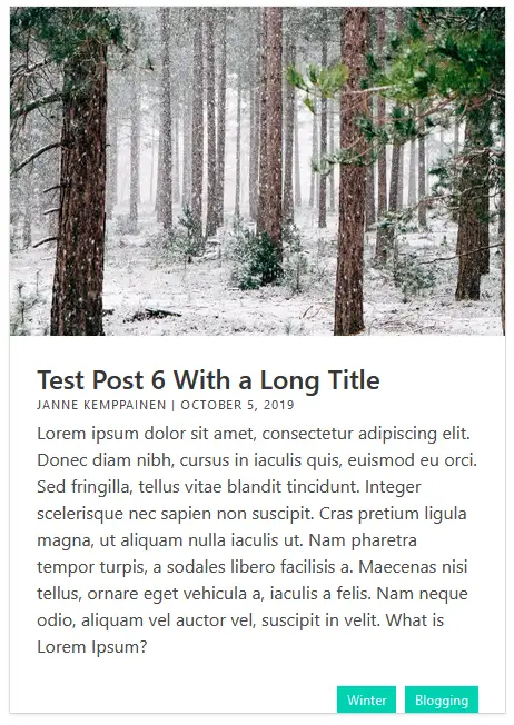
Enhanced blog post card
You can click a tag to get to the corresponding category page. These category pages actually work too because we have the fallback list page template that just lists all children of a page.
Pagination
As the amount of posts grows you probably don’t want to keep adding them on the same page to create one huge view of everything. That’s where Hugo pagination comes into the picture.
The default value for pagination is to show 10 pages at a time but you can change the value in config.toml. As I have only eight test posts I’ve dropped the pagination count to four so that I can test it properly:
paginate = 4Using the paginator is really easy because .Paginator is provided for list pages out of the box. Therefore we need to only change one line on the list.html which I’ve highlighted below:
<div class="columns is-multiline">
    {{ range .Paginator.Pages }}
    <div class="column is-half">
        {{ partial "widgets/post-card.html" . }}
    </div>
    {{ end }}
</div>
When you change the pagination count in the configuration you should see the amount of blog posts change accordingly. But how can we then navigate to the other pages?
Hugo has a partial that can do this out of the box. Try placing this pagination control definition below the columns div and see what happens.
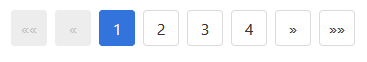
{{ template "_internal/pagination.html" . }}And it just works, sort of.. Here’s how it looks:
Hugo default pagination with Bulma
The pagination template in Hugo has been designed for Bootstrap but because we are using Bulma instead things don’t work as smoothly.
But don’t worry! We can build our own pagination template. The original template can be found from GitHub and I have adapted it below with the changes needed for Bulma. Add the following content to partials/widgets/pagination.html.
{{ $pag := $.Paginator }}
{{ if gt $pag.TotalPages 1 }}
<nav class="pagination">
<ul class="pagination-list">
{{ with $pag.First }}
<li>
<a href="{{ .URL }}" class="pagination-link" {{ if not $pag.HasPrev }} disabled{{ end }} aria-label="First"><span aria-hidden="true">««</span></a>
</li>
{{ end }}
<li>
<a href="{{ if $pag.HasPrev }}{{ $pag.Prev.URL }}{{ end }}" class="pagination-link" {{ if not $pag.HasPrev }} disabled{{ end }} aria-label="Previous"><span aria-hidden="true">«</span></a>
</li>
{{ $ellipsed := false }}
{{ $shouldEllipse := false }}
{{ range $pag.Pagers }}
{{ $right := sub .TotalPages .PageNumber }}
{{ $showNumber := or (le .PageNumber 3) (eq $right 0) }}
{{ $showNumber := or $showNumber (and (gt .PageNumber (sub $pag.PageNumber 2)) (lt .PageNumber (add $pag.PageNumber 2))) }}
{{ if $showNumber }}
{{ $ellipsed = false }}
{{ $shouldEllipse = false }}
{{ else }}
{{ $shouldEllipse = not $ellipsed }}
{{ $ellipsed = true }}
{{ end }}
{{ if $showNumber }}
<li><a class="pagination-link {{ if eq . $pag }}is-current{{ end }}" href="{{ .URL }}">{{ .PageNumber }}</a></li>
{{ else if $shouldEllipse }}
<li class="pagination-link" disabled><span aria-hidden="true"> … </span></li>
{{ end }}
{{ end }}
<li>
<a href="{{ if $pag.HasNext }}{{ $pag.Next.URL }}{{ end }}" class="pagination-link" {{ if not $pag.HasNext }}disabled{{ end }} aria-label="Next"><span aria-hidden="true">»</span></a>
</li>
{{ with $pag.Last }}
<li>
<a href="{{ .URL }}" class="pagination-link" {{ if not $pag.HasNext }}disabled{{ end }} aria-label="Last"><span aria-hidden="true">»»</span></a>
</li>
{{ end }}
</ul>
</nav>
{{ end }}The changes in this file compared to the one in the GitHub repository are mainly just changes with the class naming and moving some logic from list items to the anchor elements.
You can study the code above as much as you like but to start actually using it change the line with the internal template to the custom partial in the layouts/blog/list.html file.
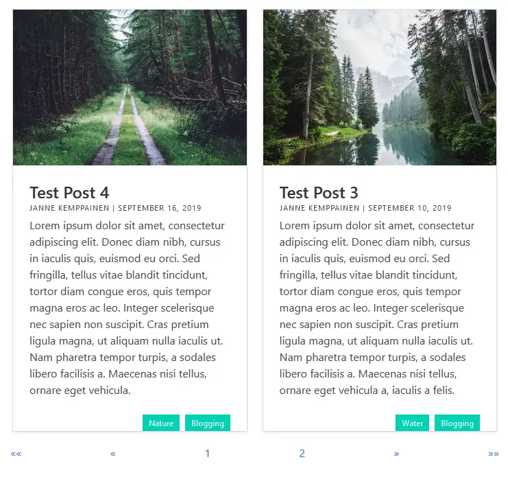
{{ partial "widgets/pagination.html" . }}It should now look a lot better! I decreased the pagination count to two posts per page to show you how it looks with more pages. Notice how the active page number is highlighted and some of the buttons have been deactivated.
Hugo pagination adapted for Bulma
You can center the pagination controls by using Bulma columns.
<div class="columns is-centered">
    <div class="column is-narrow">
        {{ partial "widgets/pagination.html" . }}
    </div>
</div>
Add static content to the page
Because our new page template adds the .Title and .Content values to the page you are free to add pretty much anything above the list of blog posts. The file that you need to edit is content/blog/_index.md which lives right next to your other blog content.
Here is a minimal example, I’m sure you will come up with something far better than me.
---
title: "Blog and content"
---

This is my blog where I *really* like to teach you all the things.

I hope you enjoy reading as much as I **love** writing!

<hr>
I just changed the title, added a little bit of text and separated the page description from the blog post list with a horizontal rule. Remember that you can also include normal HTML inside the file.
The image below shows how the final result. You can add some customizations and improvements on your own. I could come up with some examples such as limiting the text preview size or implementing some kind of a sidebar with additional navigation.
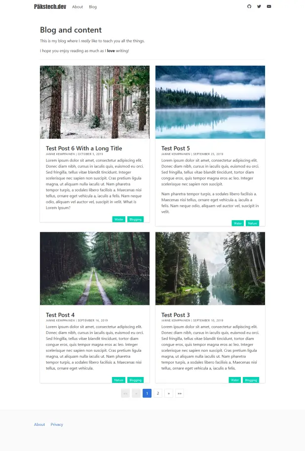
Complete blog list page
Categories
Since the post cards are now defined as ready components we can reuse them for other pages too. One such use case would be category pages that list all posts in the same category. They are actually really similar to the blog page.
There are two kinds of pages for taxonomies, and we need to implement them both. With taxonomies terms pages show the list of taxonomies, for example the categories page will show all categories of the site. On the other hand taxonomy pages show content that is related to one taxonomy item, such as “Nature” in site categories.
List pages also work as terms pages but the terms page templates can use some useful variables. That is why the default list template works for taxonomies too.
Category taxonomy page
Let’s start with the taxonomy pages as they will be similar to the blog list page. Create a new file to layouts/categories/taxonomy.html. This will contain the layout for a single category.
Add the following content to the taxonomy.html file:
{{ define "main" }}
<div class="container">
    <div class="section">
        <a href="/categories/">Back to categories</a>
        <div class="content">
            <h1>Category: {{ .Title }}</h1>
            {{ .Content }}
        </div>
        <div class="columns is-multiline">
            {{ range .Paginator.Pages }}
            <div class="column is-half">
                {{ partial "widgets/post-card.html" . }}
            </div>
            {{ end }}
        </div>
        <div class="columns is-centered">
            <div class="column is-narrow">
                {{ partial "widgets/pagination.html" . }}
            </div>
        </div>
    </div>
</div>
{{ end }}
As you can see the file contents are really similar to that of the blog list page template. The differences are the added link to the blog categories list page and the title contains “Category:” to make it clearer that the results are for a category page.
And here’s how the template looks. You can navigate to a category page by clicking the category link on a blog post or a post card.
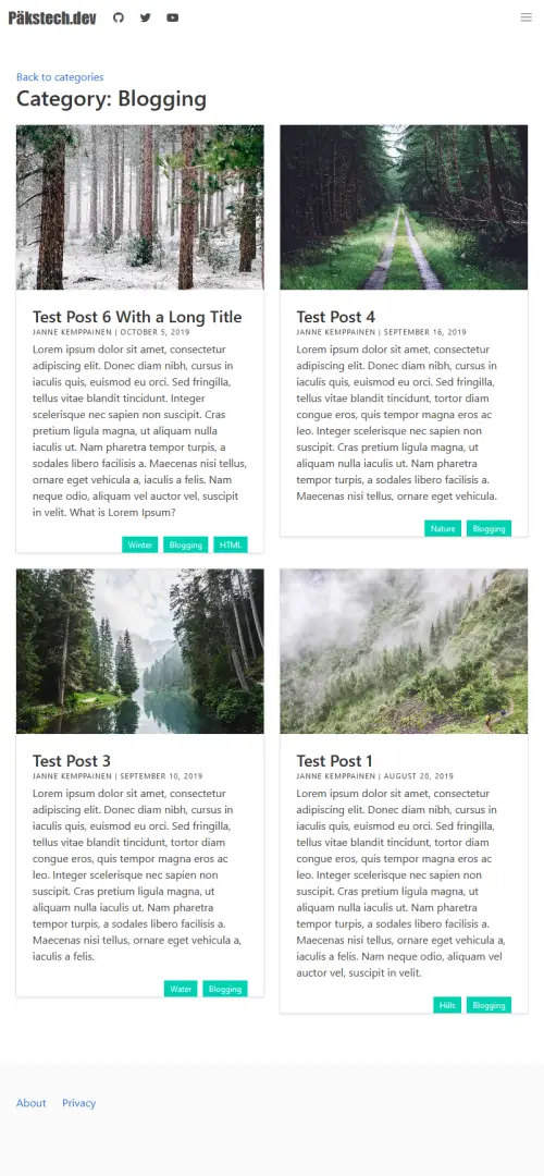
Category taxonomy page
Notice how the pagination widget is not visible because there aren’t enough posts in the category to require multiple pages.
Category terms page
Click the “Back to categories” link to test that it works. The categories page should contain all categories on the site but it is currently just a simple list because the page is rendered with the default list template.
Let’s start drafting a new template. Create a file layouts/categories/terms.html with only the main definition:
{{ define "main" }}

{{ end }}
All the links should disappear from the page giving us a fresh playing ground. Notice that instead of creating a new list template we actually created a file called terms.html. This is a special template available to taxonomies which contains taxonomy methods.
Similar to the other pages let’s start by adding container and section divs with the page content that can be edited from the Markdown file.
{{ define "main" }}
<div class="container">
    <div class="section">
        <div class="content">
            <h1>{{ .Title }}</h1>
            {{ .Content }}
        </div>
    </div>
</div>
{{ end }}
The most important part of the template is in the following snippet. I haven’t separated this into components because we don’t need to reuse the category link cards. Place this after the content div.
<div class="columns is-mobile is-multiline">
    {{ range .Data.Terms.ByCount }}
    <div class="column is-half-mobile is-one-third-tablet is-one-quarter-desktop is-one-fifth-widescreen">
        <div class="card">
            <div class="card-image">
                <a href="{{ .Page.Permalink }}">
                    <figure class="image is-3by2">
                        {{ $firstChild := index .Pages 0 }}
                        {{ with $firstChild.Params.images }}
                        <img src="{{ index . 0 }}" alt="">
                        {{ end }}
                    </figure>
                </a>
            </div>
            <div class="card-content has-text-centered">
                <div>
                    <a class="title is-5 is-size-6-mobile" href="{{ .Page.Permalink }}">{{ .Page.Title }}</a>
                    {{ $pageCount := len .Pages }}
                    <p>{{ $pageCount }} post{{ if ne $pageCount 1 }}s{{ end }} </p>
                </div>
            </div>
        </div>
    </div>
    {{ end }}
</div>
The first line starts with a columns container definition. It is going to automatically wrap lines and the is-mobile class prevents it from collapsing to a single column on mobile screens.
The range function iterates over the .Data.Terms taxonomy variable which is available on taxonomy terms pages. Here I have sorted the categories by the amount of posts they contain but they could also be sorted alphabetically.
The column definitions start on the next line. The different breakpoint settings make the view adapt nicely when the screen size is increased. On larger screens we can fit more items on one row.
The card definition is again basic Bulma stuff with an image and some simple content. I did a neat trick here with the card images. The code gets the latest post from each category and uses its image to represent the category too. The with block prevents the page generation from failing when a post doesn’t have a title image defined.
The card content contains the page title and permalink. Note that they need to be accessed through the .Page variable. This took me a while to figure out.
The amount of posts in each category is shown below the category name. It simply counts the items in the .Pages list and adds the count to the page. If the count is not one then “post” is pluralized.
And finally, this is how it looks!
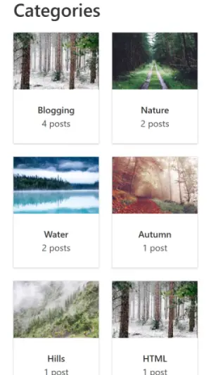
Categories on a phone screen
As you can see the mobile view has two columns. On the other hand the widescreen view has five of them:
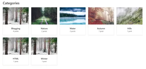
Categories on a widescreen resolution
Try to improve this design somehow. You could for example create more informational category pages and use their own title images, and maybe default to the image of the latest post if the image hasn’t been explicitly set.
Add to navigation
The last thing to do is to add the categories page to the main navigation for easy access. Add the following configuration to config.toml:
[[menu.main]]
    name = "Categories"
    url = "/categories"
The link should now appear on the navigation bar.
Conclusion
In this post you learned how to create custom reusable partial templates and applied them to list pages.
You also learned how to handle taxonomies with the practical example of categories. You should now have an idea of the special “terms” pages in the context of taxonomies.
Tell me how you would improve these templates down in the comment section.